Orignaux Moose
  • Portfolio
  • Blog
  • About
  • @orignauxmoose
Select Page

What really happened with the NYC taxi logo

by Jules | Feb 16, 2008 | Art & Design, New York | 0 comments


Makes me have a little bit more appreciation for the designers, Wolff Olill. (I’m not sure I can completely forgive and forget after the London 2012 atrocity, though.)

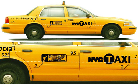
Poor Wolff Olins. Can’t get a break no matter how hard they try — and lord knows that if anyone tries hard, maybe a little too hard, it’s Wolff Olins. We all know (and most, not me) hate the London 2012 identity and pretty much everyone is baffled by the Wacom color thingie, but it’s perhaps the new New York City taxi logo that everybody, at least in the (212) area code, has hated the most. And with good reason. But, for a change, it’s not Wolff Olins’ fault.

Via Brand New

Submit a Comment Cancel reply

Your email address will not be published. Required fields are marked *

Categories

Animals Apartment Art & Design Business Crafts Entertainment Etsy Fashion FFFFOUND! Food & Restaurants Giveaways Home, Interior Design & Architecture Humor Links From My Father Misc Moose Message motivational Music News New York Photography Saving Spree Science / Technology Shopping Travel Trivia Uncategorized Vision Weekend Adventures

contact

[email protected]

@orignauxmoose
instagram | facebook | twitter | pinterest

—

theDaughter.net


© 2021 Orignaux Moose, Julie Henry Rawls. All rights reserved.