
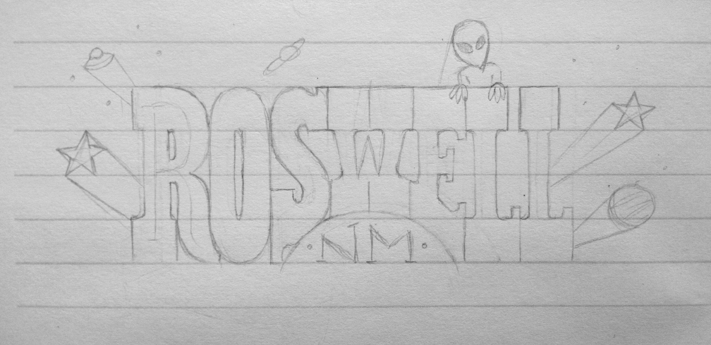
In anticipation for our trip to Roswell NM, I decided to create a little lettering project for myself! Here’s a little walkthrough for ya on how I tackled this.
Getting Started & Building
Sketchin’
I almost always start with small sketches, to get the idea out. Sometimes the idea I have in my head doesn’t really turn out the way I think it will and sketching allows me to figure out what’s going to work. I find the computer is best for refining. Perfect for getting those really, straight, crisp lines or complex shading. But, it can be too stiff, for a starting point. There are times when a more completed drawing is in order (even inking!), but usually (and in this case) jumping into Illustrator as soon as possible, with a looser drawing, was the way to go.
How I use Template Layers to make the HZ silhouettes.
In case you’re curious, my program of choice for lettering and general illustration work, is Adobe Illustrator. Everything is easily scalable and by using Template Layers I can import and basically trace my sketch. Works with photos, too!
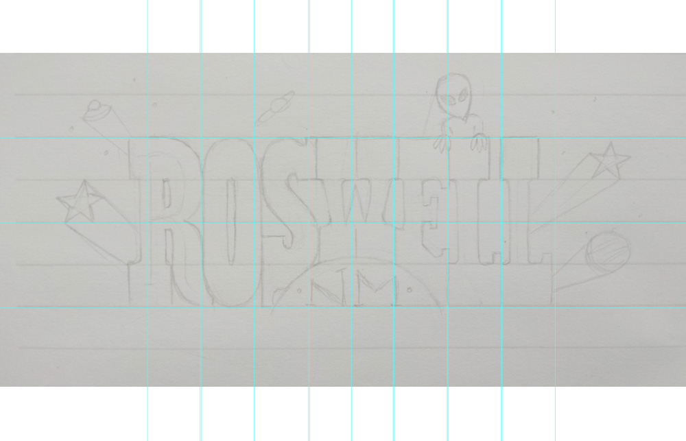
You can already see a slight deviation from the sketch, fixing the width of the letters.
I’m a big fan of setting guides; especially for something I want this structured. If this was script-y, I’d be a lot looser about really getting that set right off the bat.
[twocol_one]
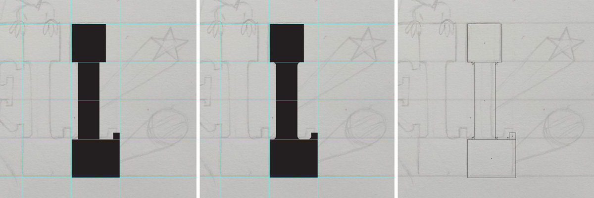
Building L
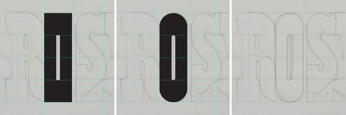
Rounding the corners to make O.
Now I start building the letters! I like to begin with straighter letters, like H’s, L’s and N’s. I feel it’s a good way to establish overall forms and widths. I don’t concern myself with color, just creating structures in black. For the rounded letters I used Illustrator’s Round Corners function (super useful!).
Side Note: For script lettering I start with strokes, not shapes, as a skeleton. This keeps a consistent line while I draw.
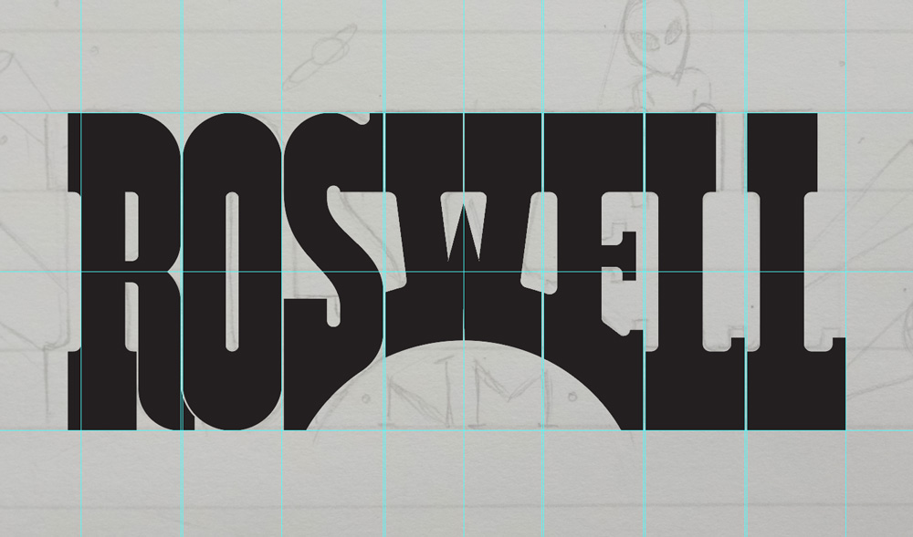
Letter structure complete!
Color & Detail
[threecol_two]
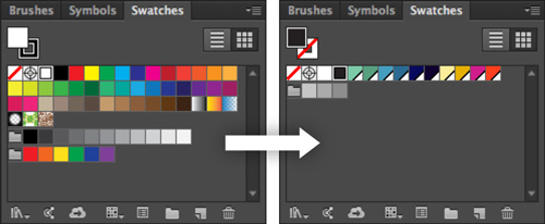
Setting up my palette.
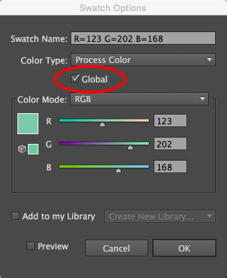
Selecting Global option
Once everything is in place, it’s time to play with color! I like to create my own scheme and remove the default swatches. By setting your palette early on, it’ll keep things unified.
I also found it’s a good idea to go ahead and set colors as “Global” as you create them. That way, if you adjust the swatch, it automatically updates that color in the illustration.

Adding Gradients
I usually illustrate pretty flatly in Illustrator (haven’t done much with the 3D stuff), but for this I really wanted to try something with depth and detail. So, gradients galore!

Adding shadows, type and background.
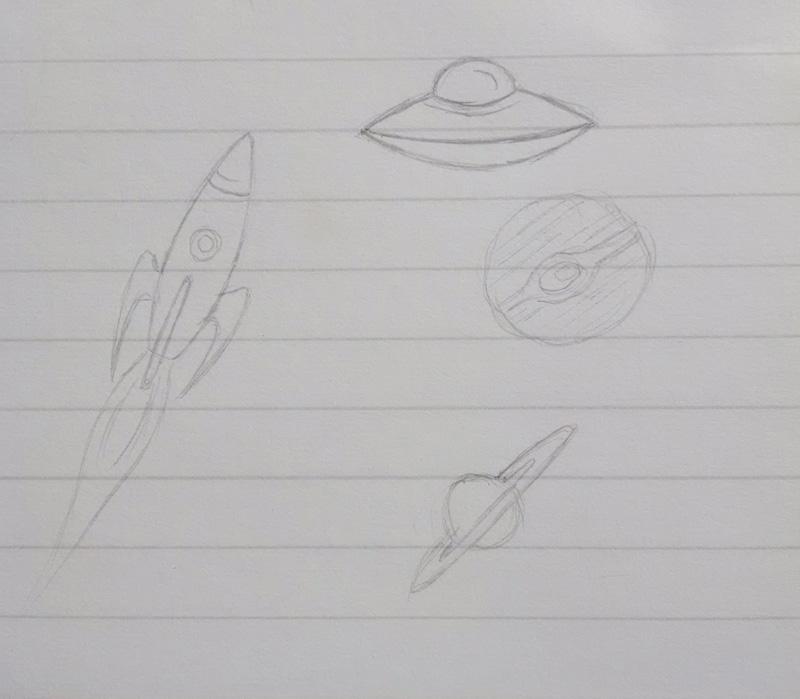
Space doodles
Then on to the drawings, all around! Some of these were in the initial sketch, while others I drew separately and imported into my template layer. The “RoadTrip To” and “New Mexico” portions are a font I liked (Adelle Bold), which I fiddled with, and not a custom type.
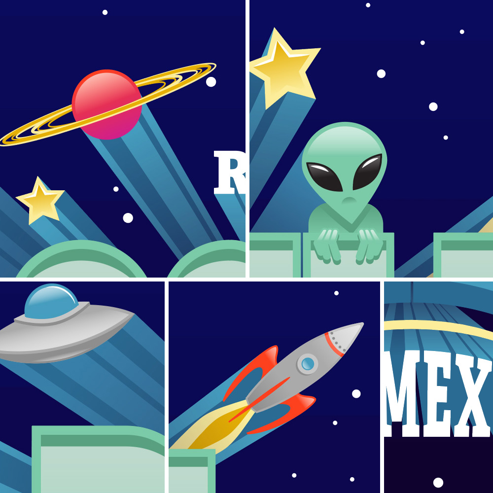
Illustration element details
And that’s pretty much the long and the short of it! Hope you enjoyed! – Jules
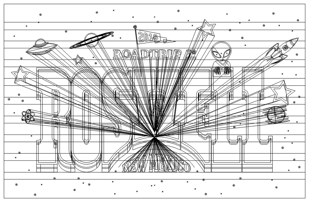
Outlined